
Bruin Bites
A student-focused app that helps students discover affordable dining options and optimize their budget.
Overview
ROLE
UI/UX designer
TOOLS
Figma, Adobe Illustrator, Notion
TIMELINE
October 2025 - December 2025
TEAM
1 project manager
1 project lead
3 designers
4 front-end developers
5 back-end developers
BACKGROUND
PROBLEM
Students struggle to find personalized dining options and discounts
There’s no single, cohesive platform for students to find deals and discounts specific to them, which contributes to the struggle of an already busy college schedule.
RESEARCH
Developing a concise survey
We developed a survey with brevity as our focus—utilizing short questions and limited options—in order to encourage responses and glean clear answers from our data.
DATA ANALYSIS
Key insights from 62 UCLA students and resulting design implications
After gathering data from a variety of students from different years and backgrounds, we analyzed our findings and extracted design implications. I analyzed the questions pertaining to app features and how that could apply to our future designs.
1. Most useful features
The top three most useful features were:
84.9% A location-based map.
79.2% Filters for price, type, distance, or rating
73.6% Verifiable/accurate deal information.
Design implications
Favor a location-based map layout for food deals; this option is most visually comprehensible & preferred.
Customizability for users, with filters for different discount/deal categories.
Ensure accurate information—through photo proof or multiple-user confirmation.
2. Low willingness to contribute
58.5% are unlikely to submit deals, rating their likelihood as a 1-2. Deterrents include:
62.3% A confusing or time-consuming process.
50.9% Forgetfulness in sharing new deals.
35.8% Lack of engagement from other users.
Design implications
A fast and minimal contribution process (ie. short text or an optional photo).
Visible engagement through likes, or comments that serve as incentives.
Deal submission could pivot towards businesses rather than users, who would be incentivized via increased traffic towards their respective business.
3. Recipe sharing interest
Most students have never shared recipes online—however, a 35.8% expressed interest. The most important factors were:
64.2% Easy process to write or upload.
54.7% Seeing how many people liked or saved one’s post.
49.1% Engagement via likes, comments, or feedback.
Design implications
A recipe sharing feature should be a low-priority feature.
If implemented, it should be relatively simple for users to navigate, with engagement as the driving feature.
AFFINITY MAPPING
Feature prioritization
Our team compiled our analyses together in order to determine what to prioritize in our designs. We finalized a comprehensive list of must-have features and problems to address.
USER FLOW
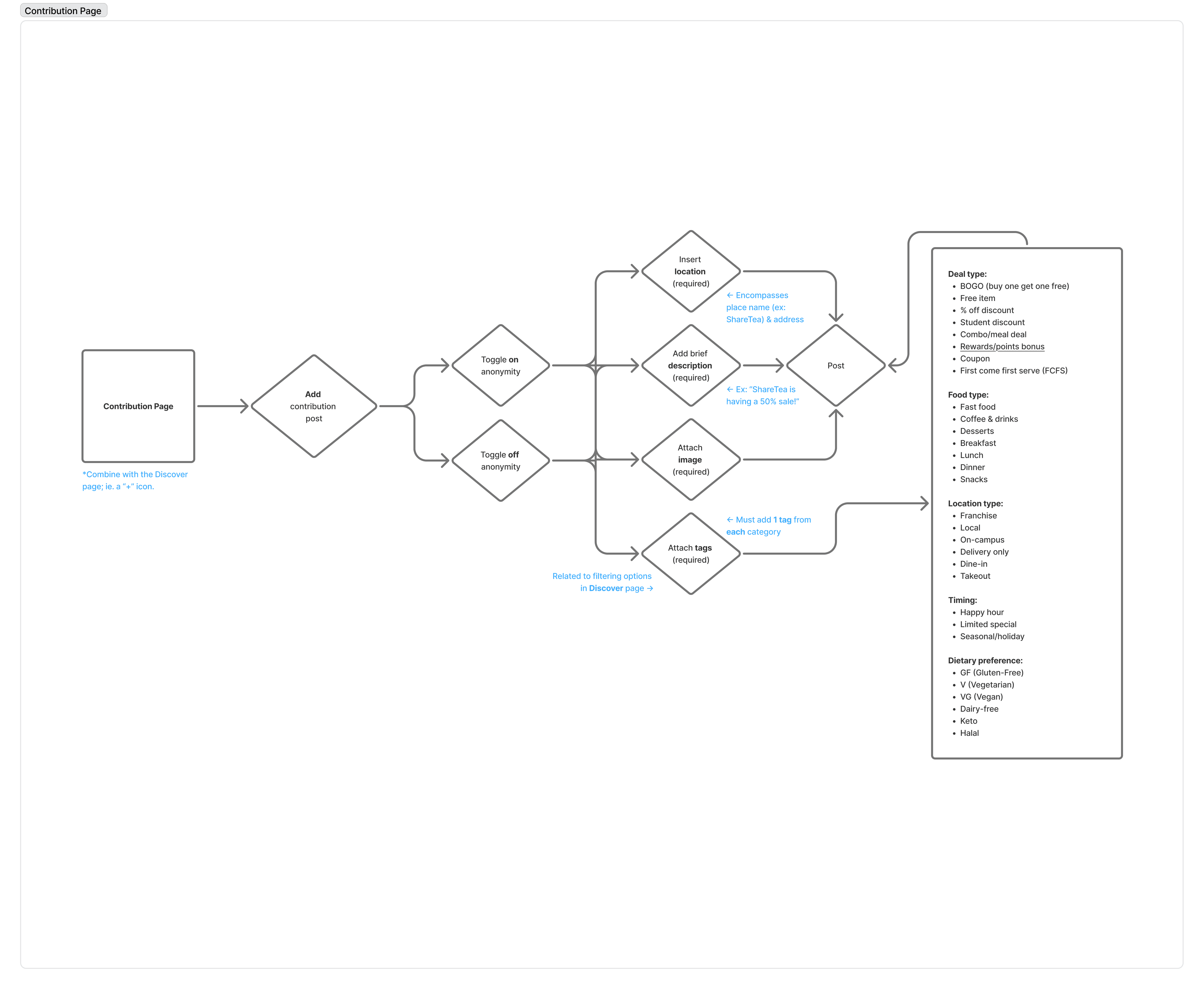
Profile page and contribution process
I was tasked with designing the profile page and process of adding a contribution. I considered what features a student may want to edit within their profile, and what steps to include when adding a contribution.

LOW-FI PROTOTYPING
Adjusting customizability and connecting user flows
While developing the low-fis, I adjusted several aspects of my design to better integrate them with other pages.
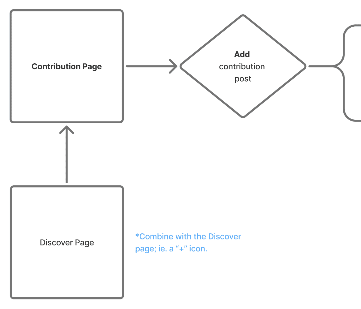
Integrated the contribution process into another the discovery page for a simplified user journey.
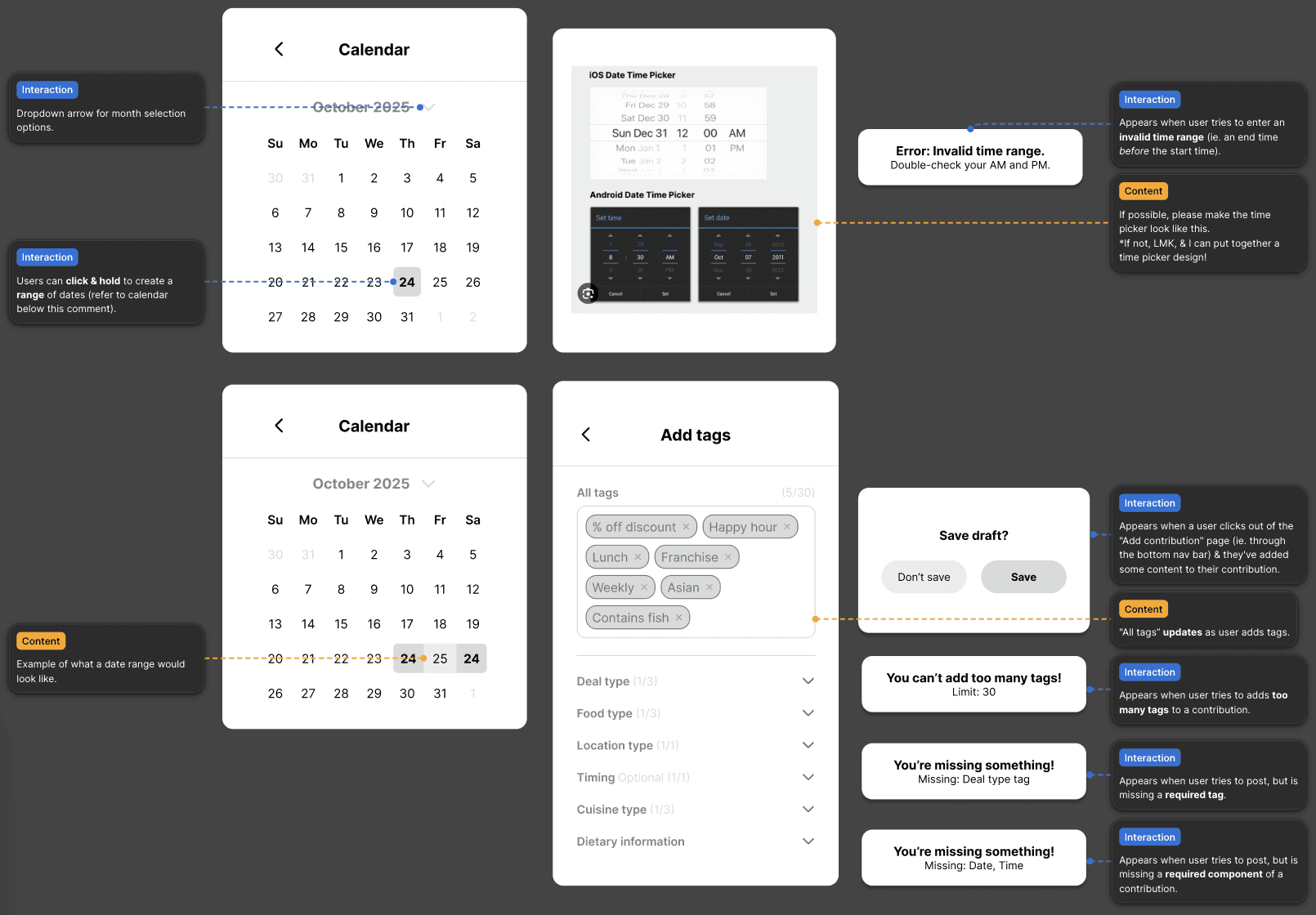
Added additional options to the contribution process—like date and time—to reflect increased customizability.
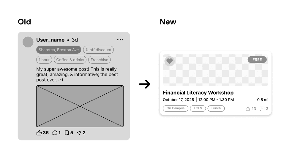
Adjusted the card layout for deal contributions and comments to display more relevant information.
Created annotations for the front-end developers to refer to, in order to more easily communicate features.
DESIGN PROCESS
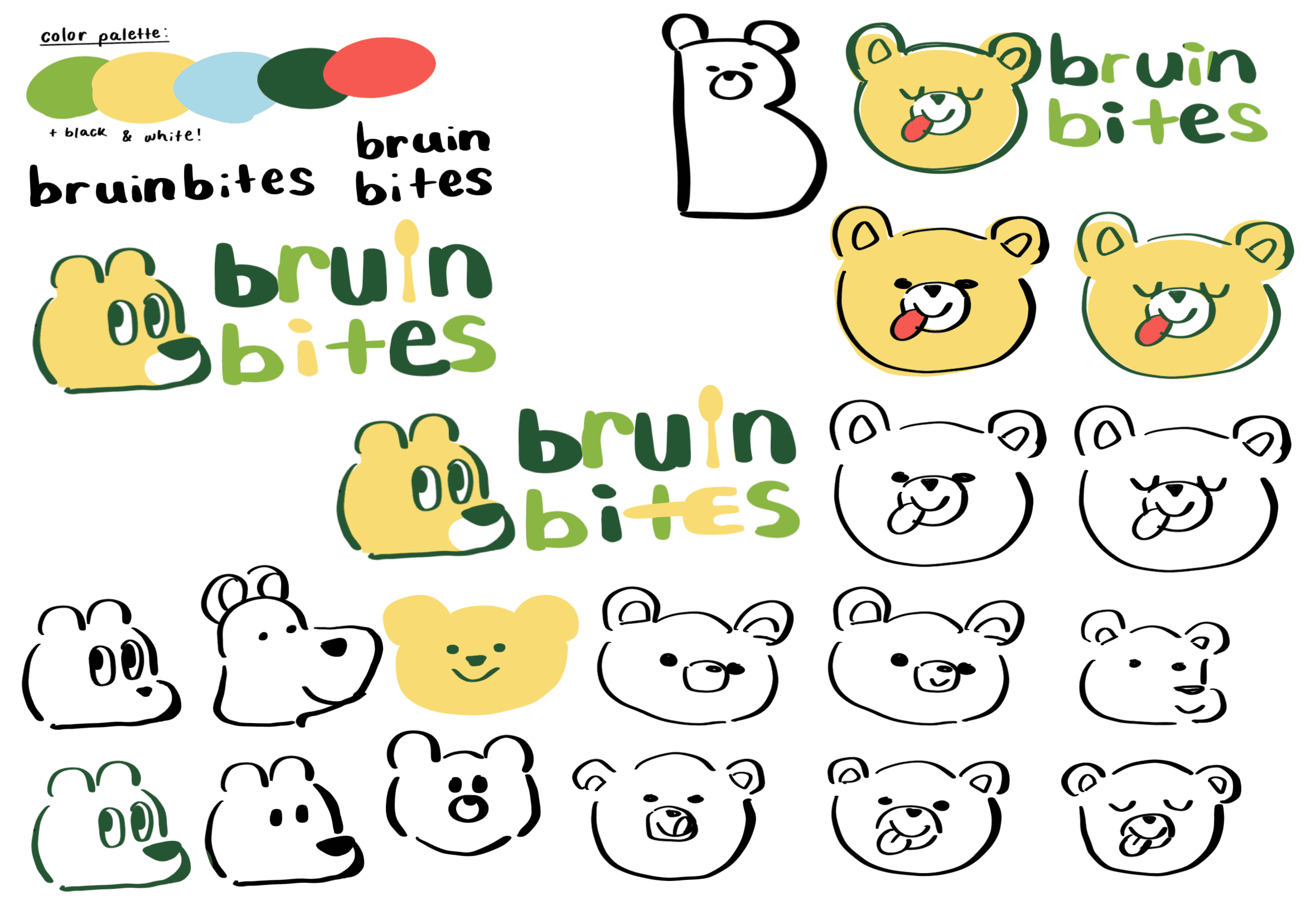
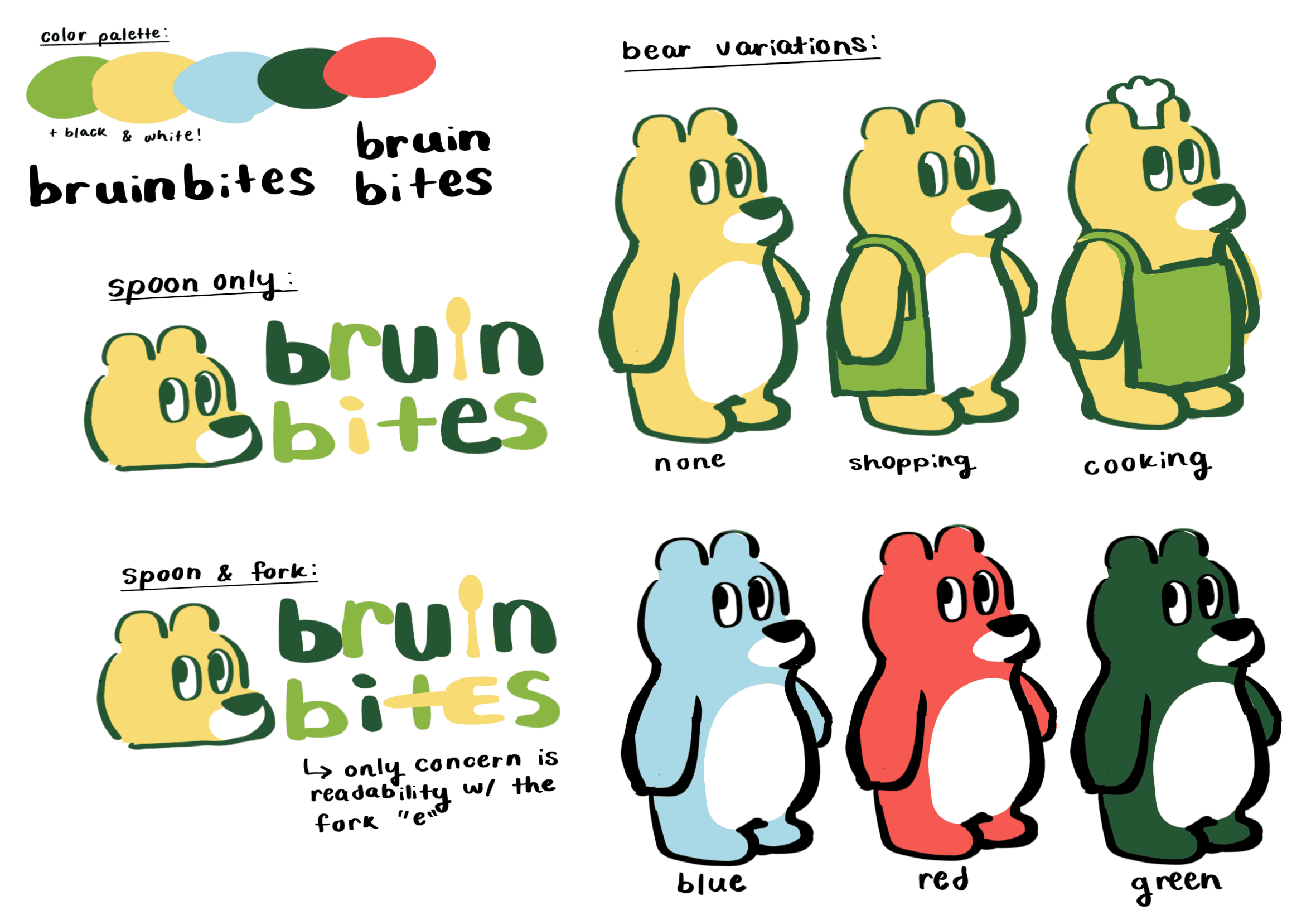
Fresh and lively design direction
After synthesizing our low-fis, we determined what visuals our high-fis would take. Ultimately, we settled on a fresh and lively color palette, which our graphics would embody.
Pinterest moodboard for graphics inspiration.
FINAL SOLUTION
✦ Customizable profile
Users can easily adjust their profile to suit their preferences.
View personal contributions and comments.
Stay up-to-date with contributors they're following.
Personalize notifications and account settings.
View contribution history through archived and liked contributions or comments.
FINAL SOLUTION
✦ Smooth contribution process
When creating a contribution, users can easily add and adjust information with lists of customizable options.
FINAL SOLUTION
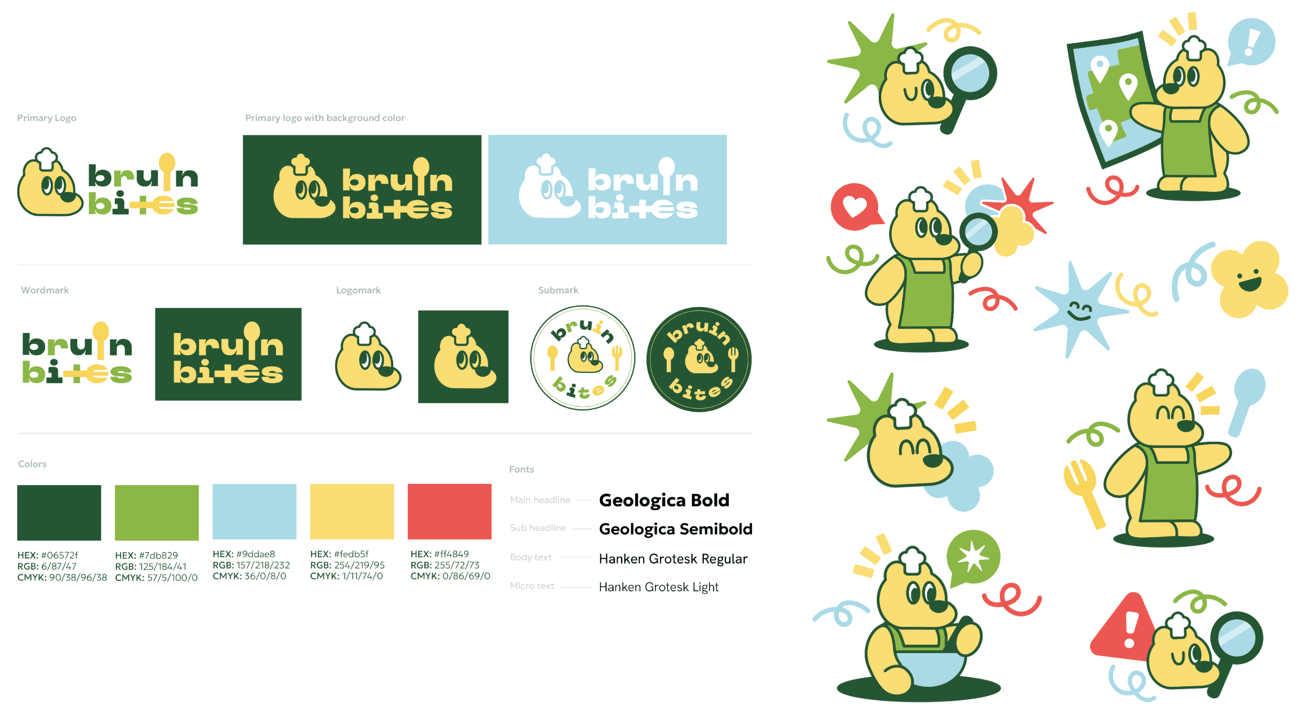
✦ Vibrant visual identity
Bruin Bites' visual identity emphasizes lively pastels, accompanied by colorful graphics and a bear mascot to highlight the student-focused nature of the app.
REFLECTION
Key takeaways
Through this project, I learned the importance of communication among designers, and the role that user needs play in ensuring that a design embodies a solution.
Communication is essential for consistency.
When working with other designers, integrating our pages into one cohesive design is key for a consistent user experience. This requires intensive communication to ensure that everyone is on the same page.
User needs are just as important as design needs.
If I could go back, I would conduct user interviews to identify personal challenges that could be addressed in our design. I would also conduct user testing to identify areas of confusion, to ensure the smoothest possible experience for students.
