
SHIPPED
WEBSITE REDESIGN
B2B + B2C
✦ Redesigning a support network for community homelessness.
Led a redesign of ECHO's website to better serve community experiencing homelessness in Austin, Texas. Focused on enhancing the experience for service providers, policy makers, and created a unifying design system.
ROLE
Product designer
TOOLS
Figma
User Testing
Notion
TIMELINE
May - Aug 2026
(15 weeks)
TEAM
1 PM
1 TPM
3 product designers
3 engineers
1 stakeholder
Overview
ECHO supports 16,000+ people experiencing homelessness across Austin and Travis County—but its website serves people in crisis, service providers managing referrals, and policymakers /donors pulling reports—all with the same generic structure.
Through Develop for Good's Summer 2026 program, I joined a team of 3 designers and 3 engineers to redesign it from the ground up, working directly with a real ECHO stakeholder over 15 weeks.

I got the opportunity to work closely with a real stakeholder, alongside several engineers, designers, and managers, in order to put together a complete website overhaul in just four months.
SNEAK PEEK
Enhancing the experience for service providers & policymakers—all under one design system
As a product designer, I owned the experiences for service providers and policymakers and their respective journeys for finding information related to homelessness. I identified each user's needs and explored how they could be unified by one design system.


CONTEXT
ECHO leads homelessness response efforts across the Austin & Travis counties in Texas
ECHO (Ending Community Homelessness Coalition) leads the Homelessness Response System (HRS) for Austin and Travis County, serving 16,000+ people through a network centered on racial equity and led by people with lived experience of homelessness.


"ECHO is committed to ensuring housing is a human right for everyone who lives in our community."
Their site has to serve four fundamentally different people: someone in housing crisis, a caseworker managing a caseload, a policymaker on deadline, a first-time community donor.
Until this redesign, all four navigated the exact same structure. That mismatch was the root of almost every problem we found in research.
PROJECT CONSTRAINTS
From research to handoff

15-week project timeline.
We had 15 weeks to redesign ECHO's site end to end—which was simply not enough time to redesign everything.
So early on, we scoped two features out as stretch goals rather than commitments:
Data dashboard revamp
This required a custom code solution; so we preserved it as a separate entity linked from the main site rather than rebuilding it from scratch.
Fluent Spanish translation
Noone on the team was fluent, so Google Translate would be used and proofread by a Spanish speaker on ECHO's team post-launch.
Naming these tradeoffs early let us focus our four months on the parts of the site with the most user impact: navigation, information architecture, and the persona-specific journeys.
USER RESEARCH
Empathizing with real user needs
Before redesigning anything, we surveyed 21 site visitors to find out where the pain points were in the current site.
72.7% were able to find what they needed, but 2.1/4 was the average score for ease of use.
Navigation confusion, missing resources, and unclear info tied at 27% each for the reasons users struggled.
58.8% came to the website because they were experiencing homelessness (the majority user base).
That gap between "found it" and "found it easily" pointed to three insights that shaped every decision after:
People succeeded despite the site, not because of it.
A high completion rate paired with a low ease score meant users were working around the design, not through it.
Most visitors are in crisis, not browsing.
The site needed to prioritize speed to answer over depth of information—especially for the majority-share user experiencing homelessness.
Navigation was equally responsible for drop-off as content gaps.
We couldn't jump into fixing the current information architecture without examining the navigation bar as well.
USER PERSONAS
Four distinct users across one website
Rather than designing for a general audience, we grounded every decision into four main personas, which ended up defining the primary website navigation.
Persona 1: Person experiencing homelessness
Persona 2: Service provider
Persona 3: Policymaker/donor
Persona 4: Community member
PROBLEM
How might we design and develop an overhauled website that gives people experiencing homelessness, policymakers, service providers, and community members the information and resources they each need—so ECHO becomes the go-to source for homelessness information in Austin?
DESIGN CHALLENGE
The core navigation experience
One of the challenges we encountered was how to set up the main navigation bar. We decided between two different options:
Traditional navbar
Closer to ECHO's existing site: a standard About page with resource tabs.
Persona-based navbar
Each tab is assigned to a persona, allowing users to self-select their journey from the top of the page.

The two navigation bar options; arrows display how each option is connected.
Neither option alone was right.
The traditional navbar was familiar but didn't solve the core problem—users still had to guess which tab held what they needed.
The persona-based navbar solved that, but risked disorienting returning users and staff who already knew the old structure.
The hybrid approach
We landed on a hybrid approach: persona-informed tabs with rewritten, more intuitive verbiage, layered onto a structure that preserved enough of the original site's logic for existing users.
This wasn't just a stakeholder preference—it also held up in usability testing (see below), where task success and click-efficiency both improved under the hybrid structure compared to early dropdown-based prototypes.

High-fidelity navigation bar.
Users can also self-select their path directly from persona cards on the homepage, giving two entry points into the same underlying structure.

Low-fidelity home page.
DESIGN CHALLENGE
Nested dropdowns vs. landing pages
The bigger information architecture question: should each nav tab open a dropdown menu, or lead to its own landing page?
(1) Nested dropdown approach; (2) landing page approach.
Rather than assume, we tested both directions directly with users.
USER TESTING
7 participants, 4 tasks, & 1 scenario per persona
Our testing setup: 7 participants on UserTesting, each given one task tied to their assigned persona — a first-time visitor, a service provider, a policymaker, and a community member.
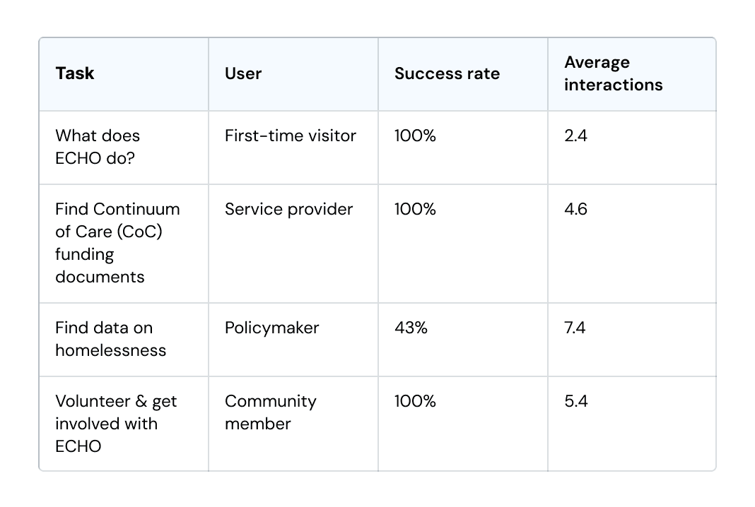
Three of the four tasks were successful—but policymakers trying to find homelessness data succeeded less than half the time, and took almost twice as many clicks as any other task.
One user said that the data tab felt "hidden amongst everything else."
This settled the navigation issue and pushed us to pivot towards landing pages instead of dropdowns.
ITERATIONS: BEFORE & AFTER
Stakeholder feedback & key improvements
Four rounds of stakeholder and user-testing feedback drove the biggest changes to the design, roughly in order of impact:
01. Navigation structure
Before • Dropdown menus buried resources under hover states.
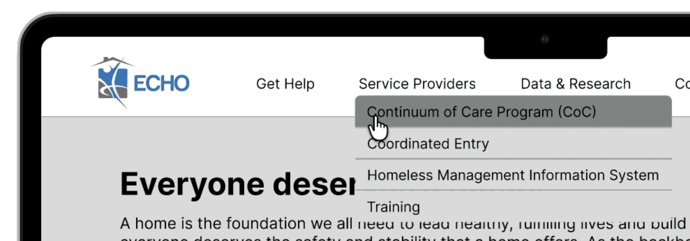
After • Dedicated landing pages for each tab, directly responding to 43% policymaker success rate above.
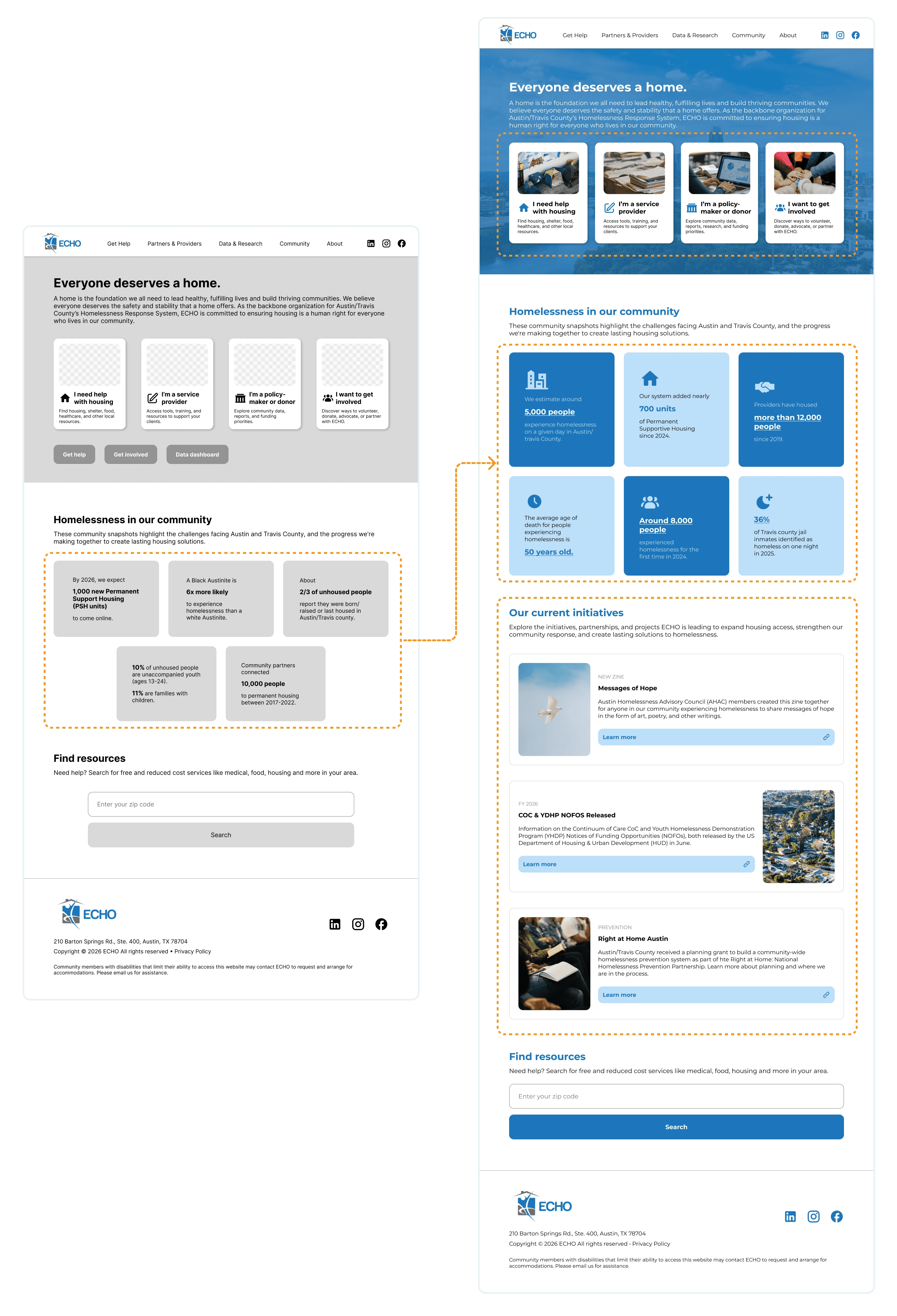
02. Highlighting the homelesness dashboard
Before • Homelessness dashboard hidden as a normal tab.
After • At the stakeholder's request, we elevated it into the page header, making ECHO's most requested resource the most visible.

03. The first impression
Before • The homepage gave no sense of ECHO's impact or mission at a glance.
After • We added prominent impact statistics, current initiatives, and persona pathway cards, so a first-time visitor understands what ECHO does within seconds of landing.
04. Aligning with internal vocabulary
Before • Section titles used outdated, internal-facing terminology
After • We rewrote labels to match the language service providers actually search for.

By incorporating feedback from both the stakeholder and user testing, we were able to put together a cohesive website redesign of ECHO's website.
FINAL SOLUTION
✦ Unifying access to homelessness resources in Austin

Before
Ambiguous categories with confusing navigation
Critical information buried under dropdowns, requiring excessive clicks
Inconsistent formatting that felt clunky and unpolished
After
Streamlined landing pages built on a clearer information architecture
Condensed content with clear, intuitive affordances
One unified design system across every persona journey
All pages are unified under one clean, cohesive design system—adaptable and accommodating of dense information:

Explore ECHO's enhanced component set!
FINAL SOLUTION
✦ A home page designed to build trust
Persona pathway cards let users self-select their journey immediately
Client impact statistics establish credibility from the first scroll
Current initiatives keep the homepage dynamic rather than static
FINAL SOLUTION
✦ For service providers: resources, documents, and information to support clients
Section labels now mirror the exact language service providers search for
Expanded the scope to cover resource gaps surfaced during research—directly responding to what staff told us they couldn't find under the old structure
FINAL SOLUTION
✦ For policymakers: relevant data and research, front and center
Distinct, color-coded interactive cards organize different resource types
The homelessness dashboard—the resource that failed 43% of users in testing—is now a headline element instead of a buried tab
DESIGN CRITIQUE
Insight from industry professionals
We presented our project to professionals from Bloomberg and UserTesting, who provided us feedback on our overall approach, impact, and teamwork.


What we did well
Clearly communicated solution, decisions, and project timeline
Well-coordinated, well-paced presentation with a clear problem statement
Handled follow-up questions thoughtfully
What we can improve
Distribute work more evenly across the team
Share more personal perspective on what we found interesting or learned
Our team scored an average of 9.34/10!
IMPACT
The results of a 15-week project…
21 users surveyed to examine pain points with original website.
12 responsive, high-fidelity screens designed end-to-end.
Designs validated with 7 in-depth usability tests.
Dev-ready design to be shipped in WordPress & impact 16,000+ people.
REFLECTION
What I learned working under real constraints
Working with ECHO gave me valuable experience in working with an actual stakeholder, as well as utilizing user testing and determining what our product's priorities were when examined under genuine stakes.
Communicating with a non-technical stakeholder.
Prioritizing product needs with real stakes.
Leveraging user testing and stakeholder feedback.
My certificate & (some of) my lovely team! :)


