
BruinPlace
A centralized housing marketplace for students to find off-campus housing options.
Overview
ROLE
UI/UX designer
TOOLS
Figma, Adobe Illustrator
TIMELINE
January 2026 - March 2026
TEAM
1 project manager
2 project leads
4 designers
6 developers
BACKGROUND
BruinPlace is a centralized housing marketplace designed to help UCLA students find and lease off-campus housing options, all in one place.
I joined the project as a UI/UX designer, and I created a cohesive design system and worked on developing the project's core pages.
PROBLEM
Finding off-campus housing is a fragmented process
The current process for finding housing is complex—it involves navigating through dozens of platforms like Facebook marketplace, Zillow, Instagram, or just word-of-mouth. And even through this scattered information, nothing is completely guaranteed.
In order to reduce this overload, BruinPlace serves as an all-in-one platform for UCLA students' housing needs.
RESEARCH
Identifying student struggles
We based our design process off of data gathered from 30+ user interviews and 100+ survey responses. Conslidating this information, three main problems stuck out:
Listing information doesn't account for student needs.
Need to navigate dozens of platforms to see all options.
Lack of trustworthiness for listings and posters.
COMPETITIVE ANALYSIS
Understanding existing solutions
We analyzed popular housing platforms—Zillow, Apartments.com, Relator.com, and Redfin to understand common features in the housing search process.
Across all of these platforms, key gaps included cluttered interfaces, limited customization, and a weak focus on students.
Our main goal was to design a more streamlined, personalized experience that simplifies comparison and is relevant to students.
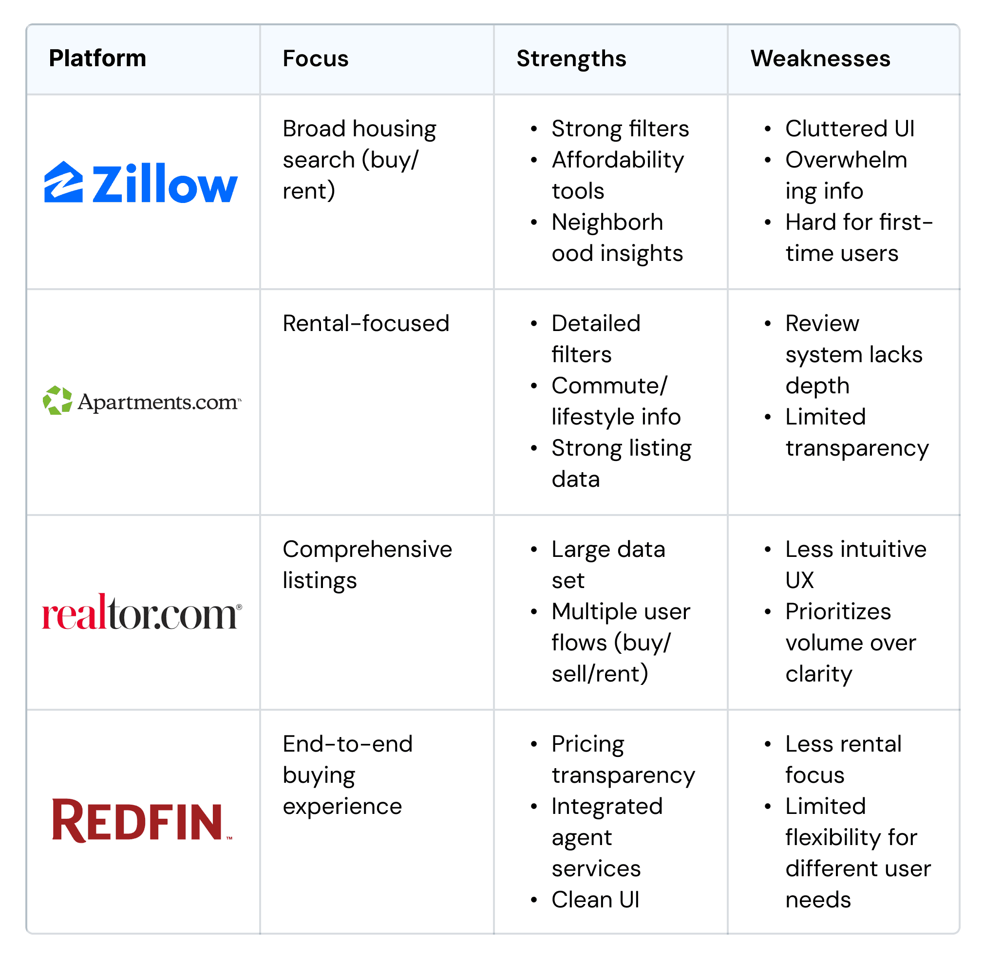
Simplified competitive analysis chart.
USER FLOW
User journey
I designed the user flow for the planned browsing page—this would be the platform's core page, housing the listings and map split screen navigation.
Then, I connected my flow with the other designers' flows. This allows us to address inconsistencies across our flows, contributing toward a cohesive user experience.

Browse page flow, with a map and listings split screen.
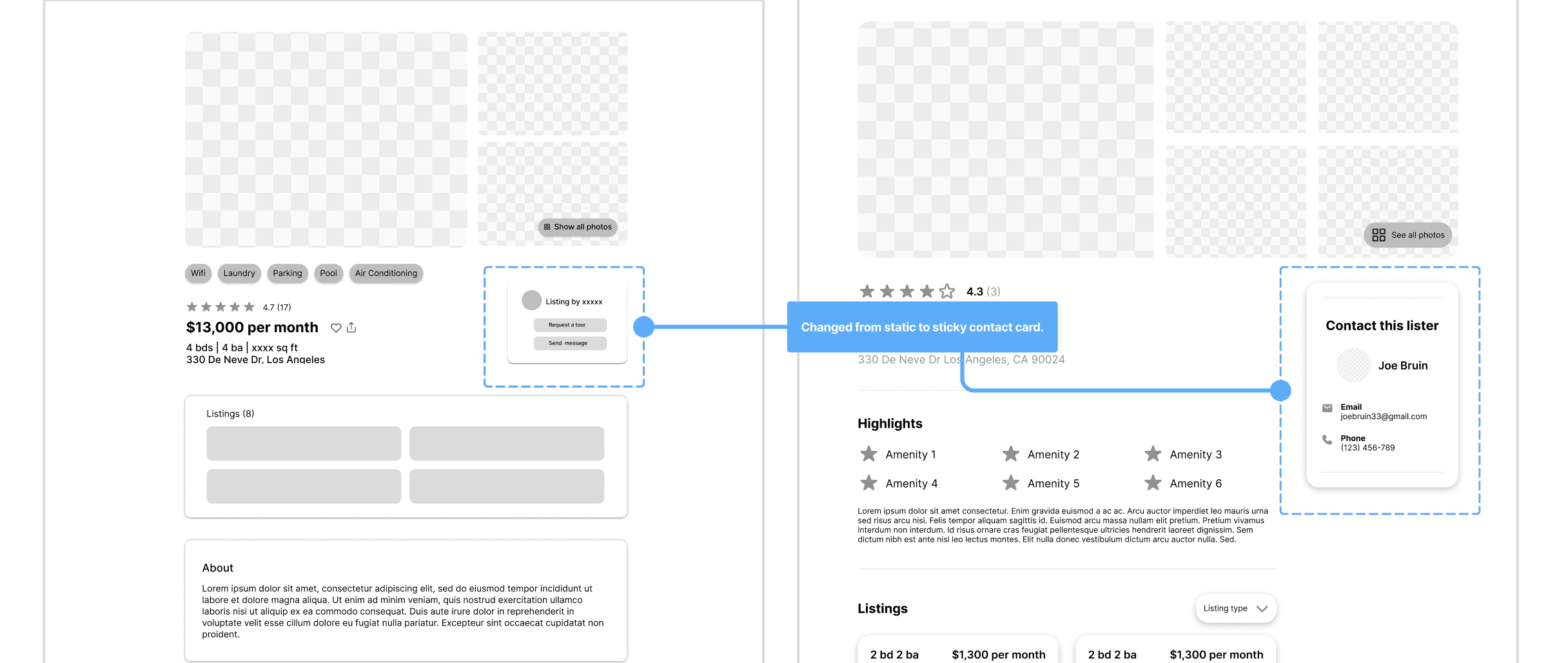
CHALLENGE
Listing view approach
One challenge we ran into was how to display an individual listing's information. We explored different options for the listing pop-up: upon clicking a listing…
Option 1: Overlay
User flow: Listing card → small overlay showing key info → expandable to full page
Pro: Avoids multiple tabs
Con: May display repetitive info; can't view multiple listings at once
Option 2: Full page
User flow: Listing card → dedicated full page
Pro: Information isn't condensed; ability to open multiple listings at once
Con: Multiple tabs open = less streamlined
Ultimately, we chose a full-page view—its larger space accommodates the amount of information, while providing better flexibility to explore multiple listings.
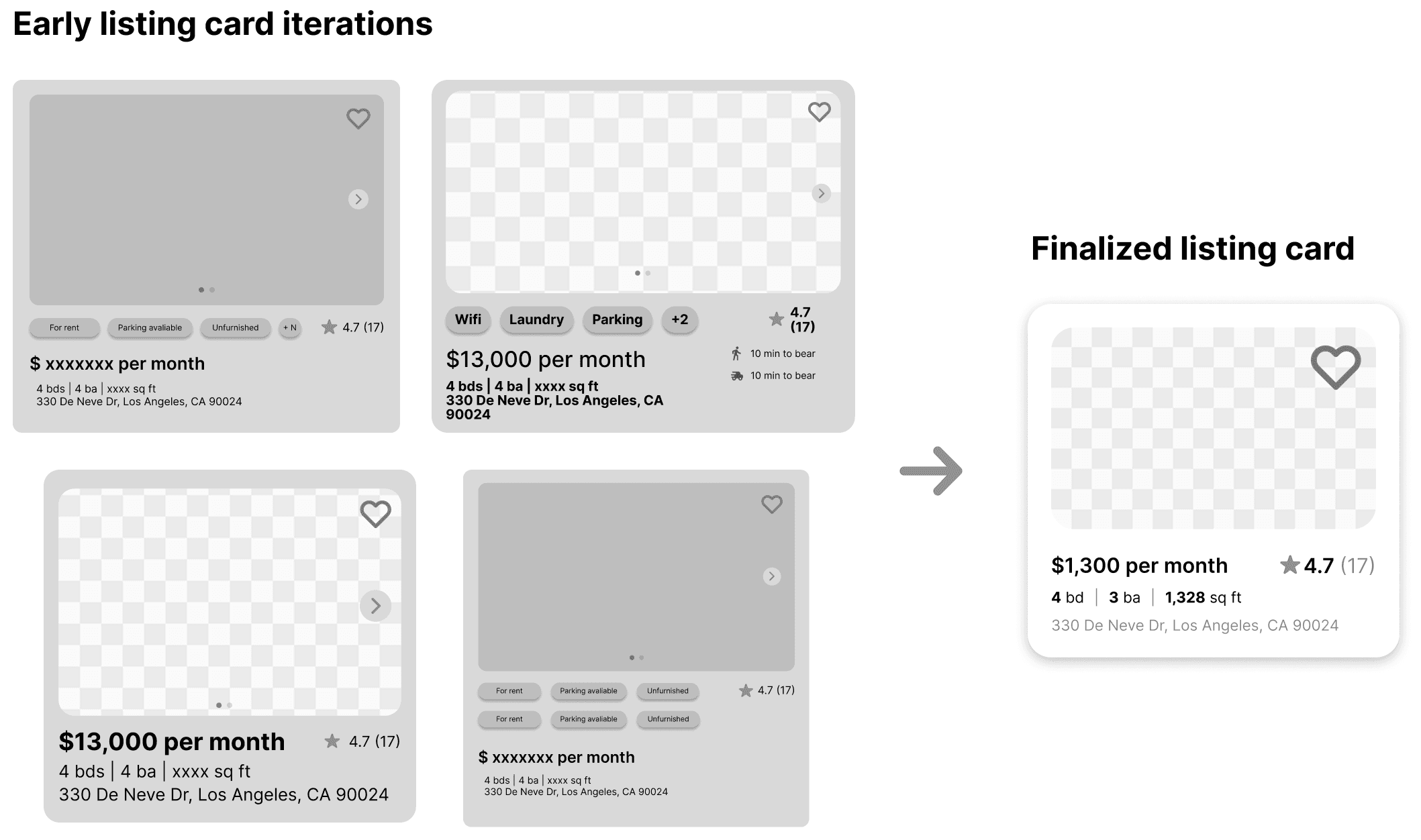
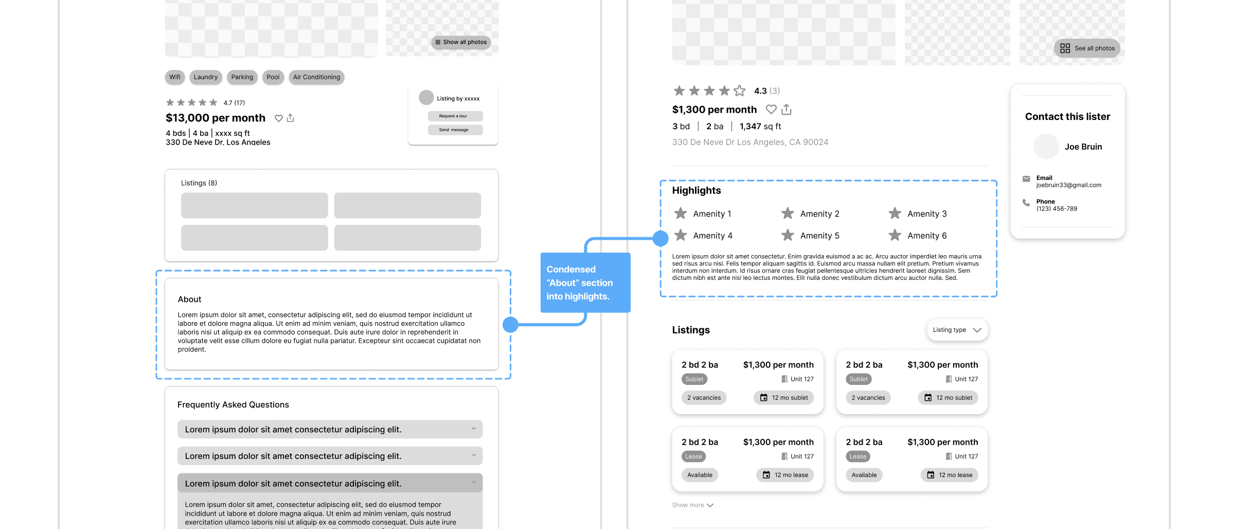
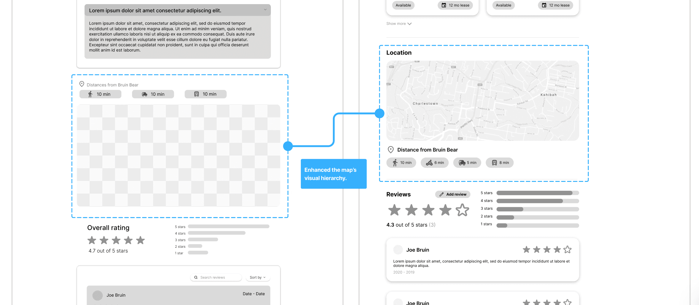
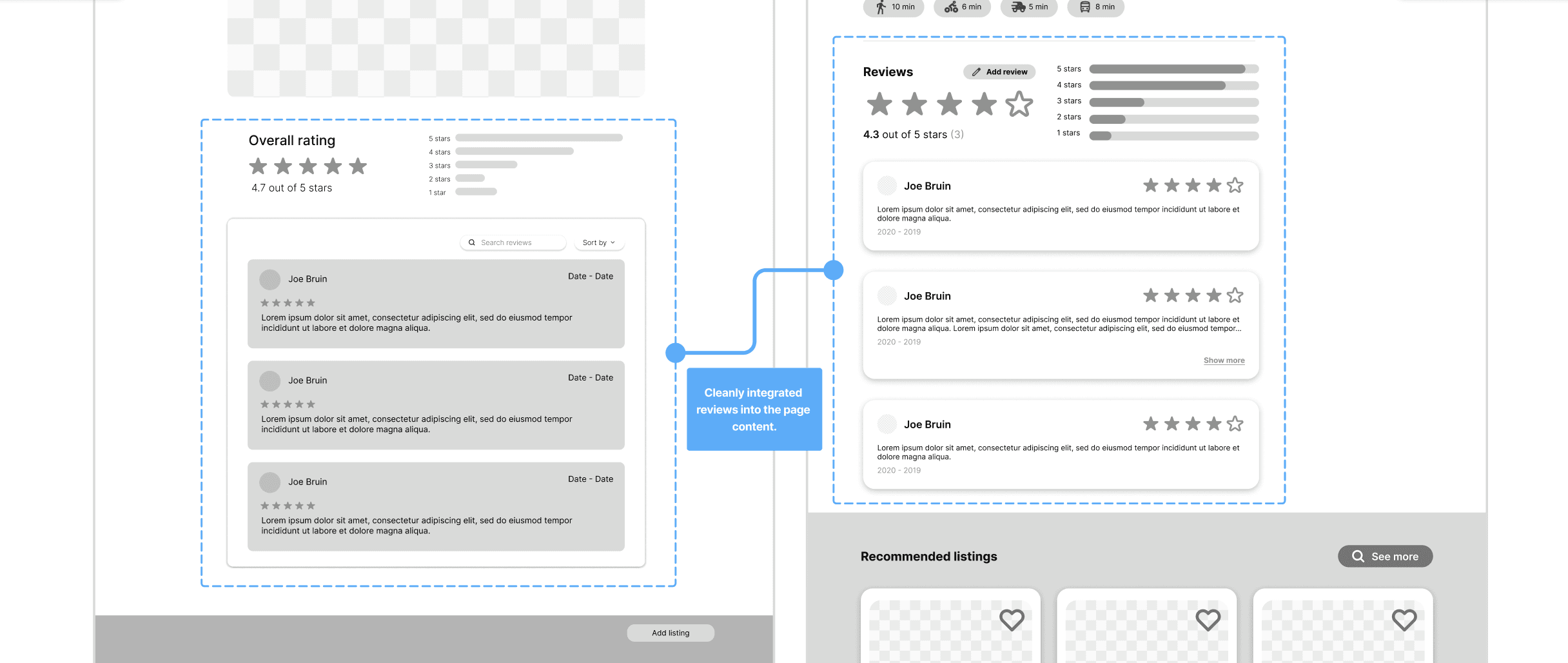
LOW-FI IDEATION
Exploring variations
For the sublet card, I focused on clarity and digestibility, refining it into a clean, balanced component that highlights only essential information.
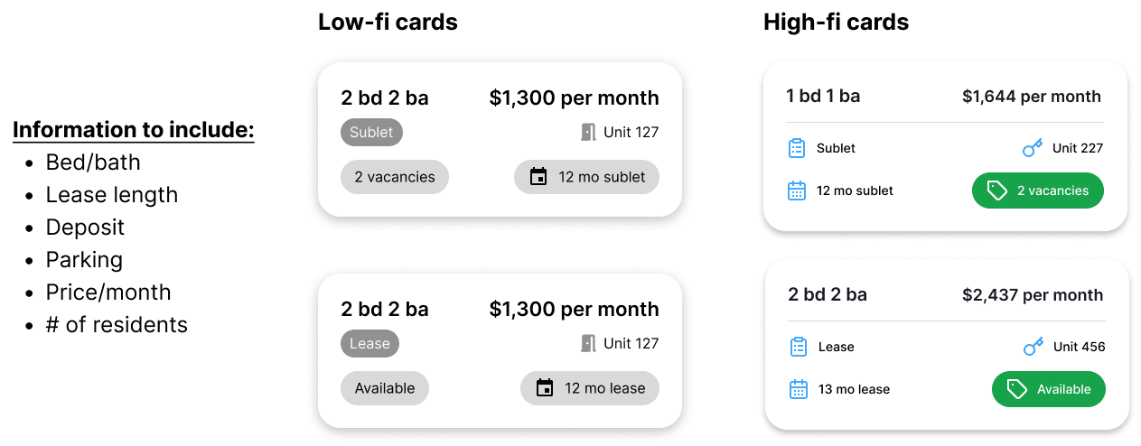
Additionally, I explored multiple listing card iterations, moving away from early cluttered, text-heavy designs toward a more minimal, scannable layout.
For the listing page, I collaborated with another designer; we each designed different versions to then combine. I consolidated our ideas and streamlined the design by simplifying elements.
My main focus was highlighting only essential information to the user, presented in a way that wouldn't overwhelm them.
DESIGN SYSTEM
Building on a design system
The developers requested that we use shadcn UI as a baseline for our components.
I customized elements like corner radius and color to align with our low-fidelity designs, creating a distinct visual identity while maintaining overall cohesion.
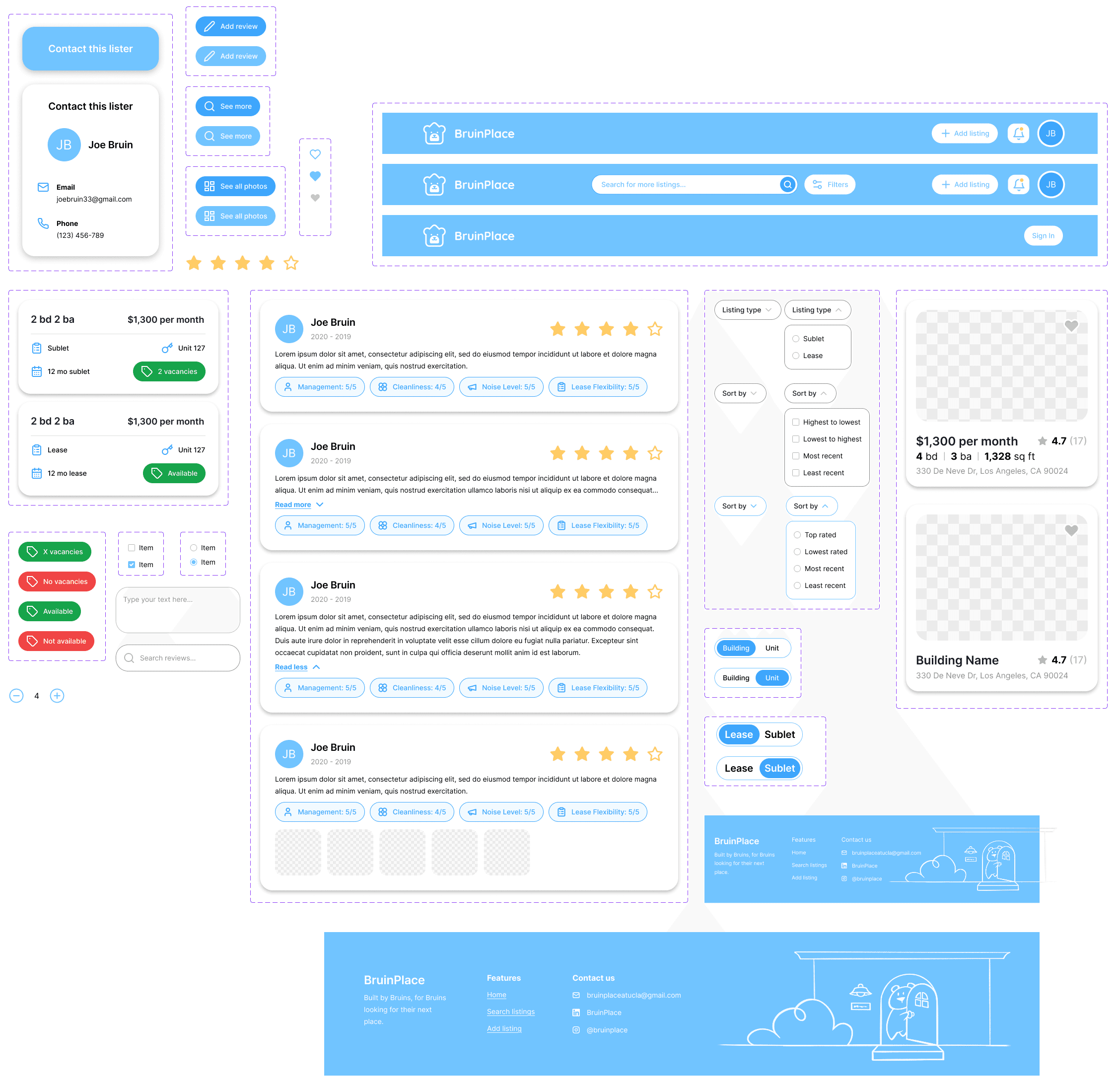
Project components.
USER TESTING
User feedback and insights
I conduced user testing with three participants to evaluate the website's navigability and interactions. My findings and adjustments are outlined below.
Navigation & discovery
Users easily found building and individual listings once visible
Split screen view had low discoverability—often missed or found indirectly
Some confusion with apartment terminology (e.g., lease, sublet, unit)
Core interactions
Review creation and listing creation were easy to locate and use
Users expected tags and contact info to be clickable and attempted interaction
Individual listings were easy to navigate once accessed
Resulting adjustments
Made the split screen view easily navigable in the header.
Improved interaction with contact information.
Clarified terminology with clear pictures and corresponding information.
FINAL SOLUTION
✦ Simplified listings
Clear separation between building and unit listings, each displaying only essential information for quick scanning.
FINAL SOLUTION
✦ Interactive search
Interactive map with split-screen navigation and robust filters, enabling users to efficiently explore and customize their search.
FINAL SOLUTION
✦ Curated by students
User-generated listings and reviews create a trusted, community-driven platform for discovering housing options.
REFLECTION
Key takeaways
If given more time, I would've refined the experience for users who create listings, focusing on making their workflow more intuitive.
Expand into the relator's perspective.
Visualize the user experience for realtors by providing a dashboard to manage listings. This ensures the platform supports both sides of the marketplace and improves communication efficiency.
Streamlined listing process
Break up the "add listing" process into a guided, multi-step flow. Adding features like progress indicators, validation, and save-as-draft can help users complete higher quality listings.
